Posts

HW14

Image
"Cats Away" Link:  http://www.animationworksllc.com/art-and-photography.html This image attracted me with its rainbow style plain with the black and white sky and cats flying in the sky. This has asymmetrical balance with the cats on one side and the plane on the other. The colors look most like the triadic color wheel and some monochromatic too.

HW13

Image
The French Flag This flag has had its share of history in the country. Over many revolutions between each other, this flag represents the balance between each other. The flag has been swapped for others but it always comes back to this one. And its been that way for 200 years. Both colors red and blue being on opposing sides showing the difference and balance. Many flags would copy this but seem forgotten unlike the french flag.

HW12

Image
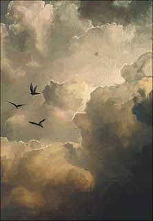
Brown and Gold Essence Link:  https://www.pinterest.co.uk/pin/497718196298082888 In this image, We have a mixture of Brown and Gold. Two unlikely colors you would think of when doing a non color wheel example. Because you cant find an example. So I decided to think outside the box and do two colors that weren't in the color wheel. So I decided to do this. Lots goes into a drawing like this. It makes cloud very colorful even without the use of the primary or secondary colors.

HW11

Image
Name: Unknown Link: https://www.slideshare.net/markusturner/turnermarkusppp In this image, we see a close up of a woman's face crying but when we look around the face its like a winter wonderland of a mountain with the tears as a river. With trees around the skin and the skin is grass to the small girl in the picture. Very creative.

HW10

Image
This image is an example of analogous color. The warm colors give it a soft feeling to it. This is a complementary example the Red tulip goes well with the green stem and the background. This is an example of monochromatic. All are different shades and tints of violet in some degree.  this is an example of triadic. The Burger King logo is perfect for the Red Yellow and Blue. The Primary Colors.

HW9

Image
Colors of Autumn Link: http://cowbird.com/story/80469/The_Colors_Of_My_Autumn/ What I like about the image is the whole thing is just warm colors and I just fell so lively watching and looking at it. I feel like im there in person.

HW8

Image
  Godzilla Vs Hedorah (1971) Weird Scene Number 486.7 So here's something that Im passionate about. In the weirdest monster movie ever, Godzilla vs Hedorah, Theres many animated segments that dont really add anything to the story but more like visual ques to the next scene. Here are two ladies with masks on to avoid the toxic pollution the bad monster Hedorah creates. Smog comes off and their faces turn black with other colors inside but the rest of them are still the same, the faces come together and its revealed to be the area in which the monster attack Tokyo. Its an odd choice for positive and negative space but its something you probably wouldn't expect that seem to fit with the idea. The video here shows the whole scene and the context of it.